About
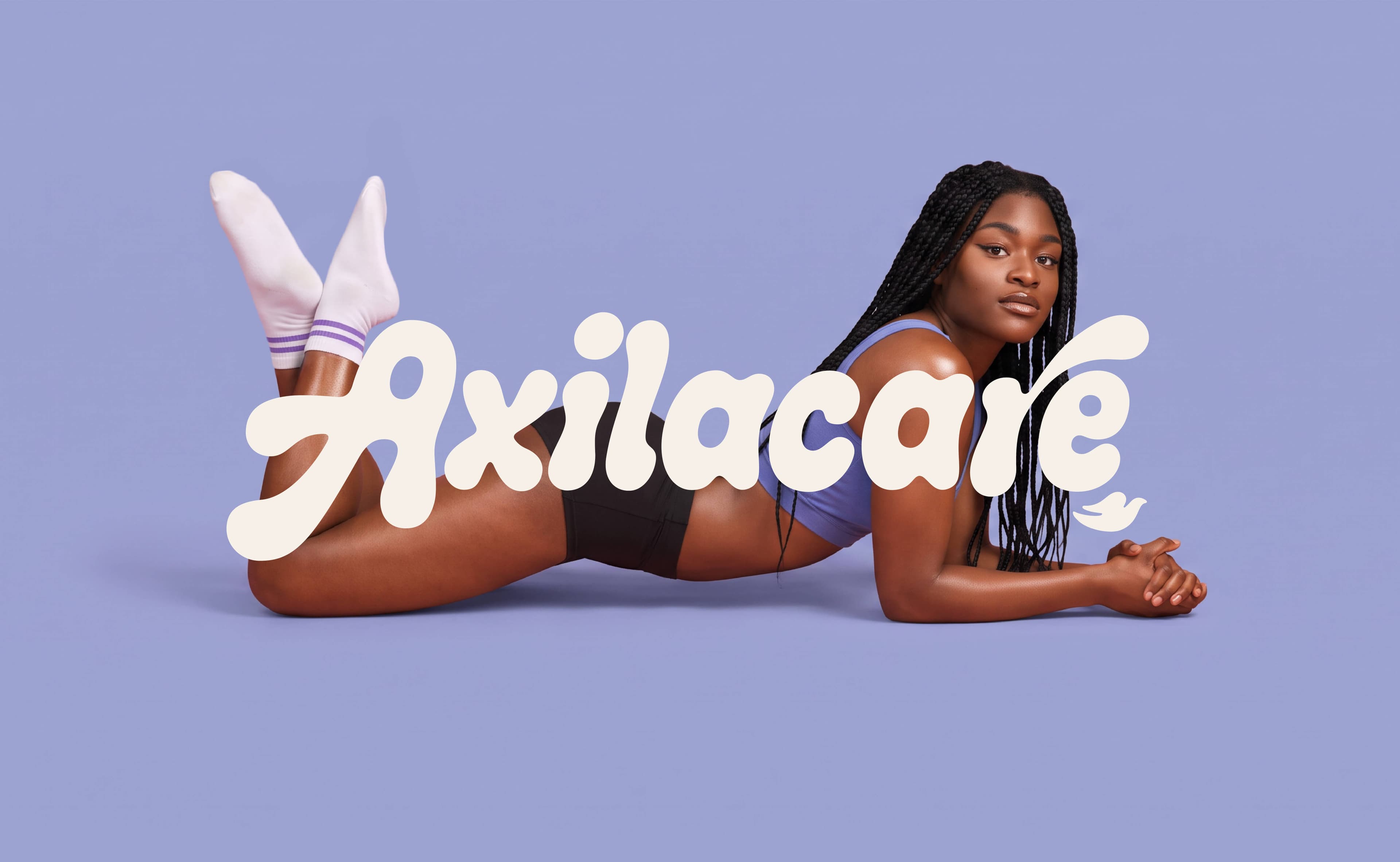
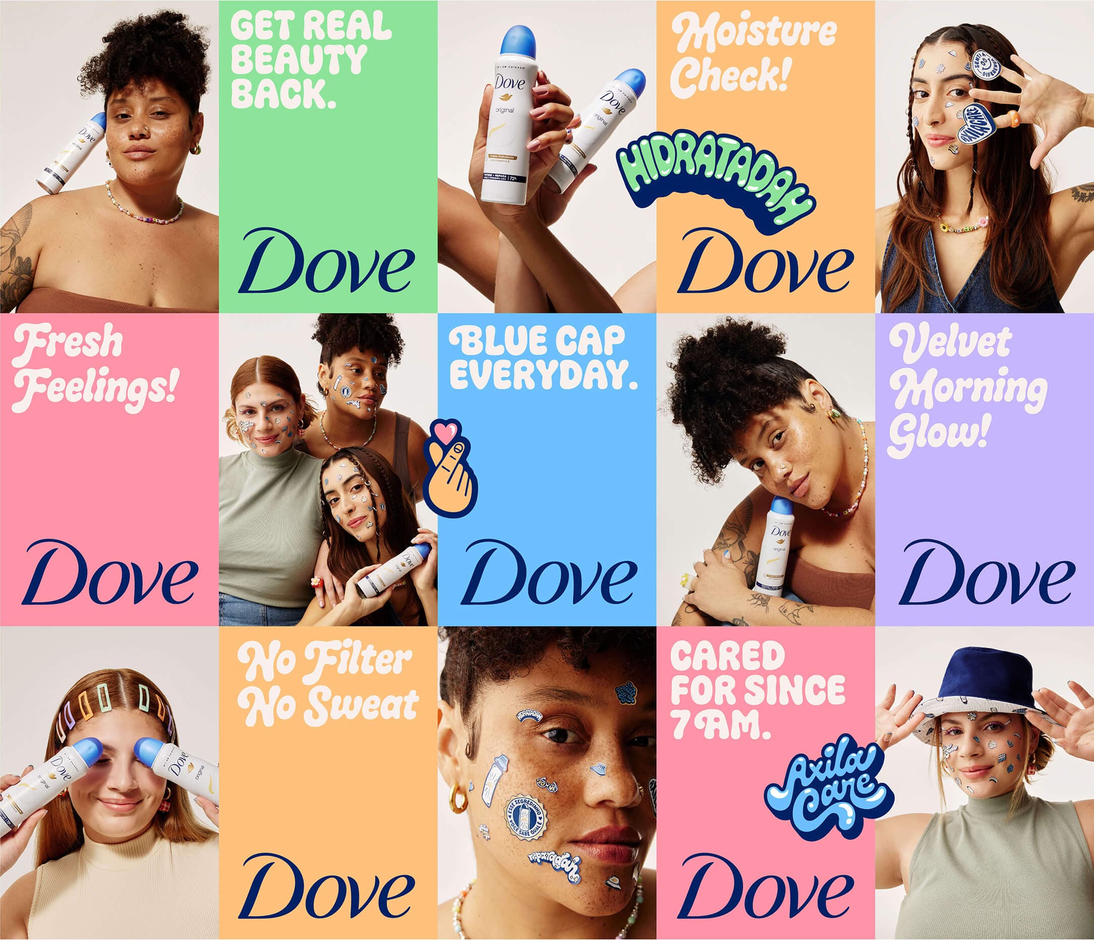
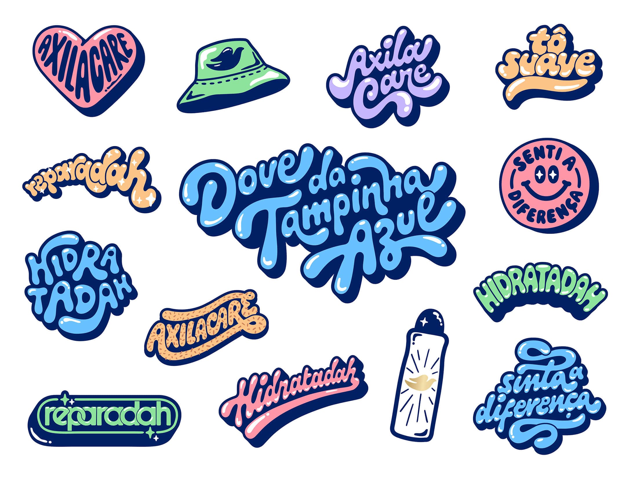
In Brazil, everyone knows Dove’s deodorant as “the one with the blue cap”. For the Dove da Tampinha Azul campaign in 2023, I was invited to give that nickname a voice, or two, actually.
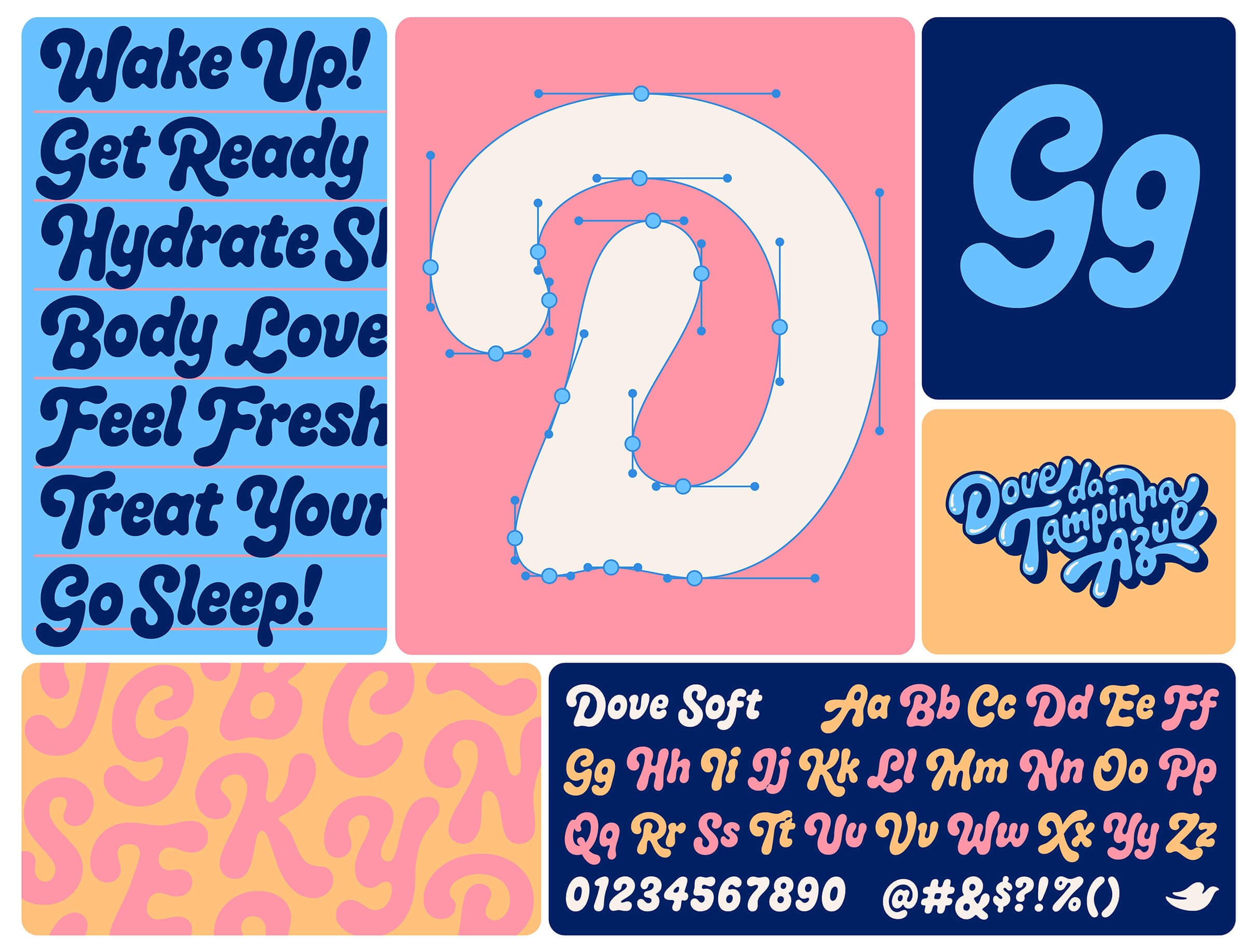
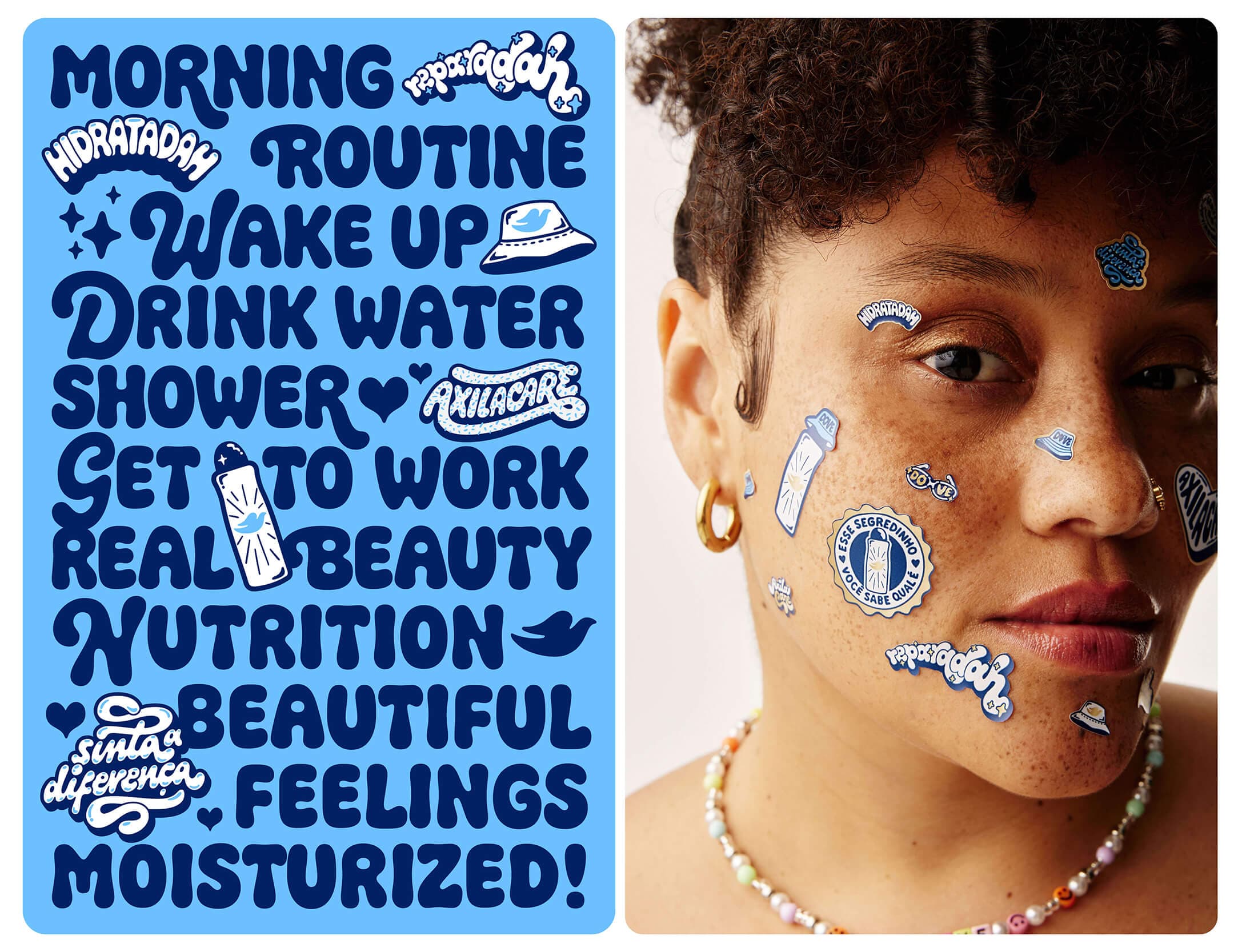
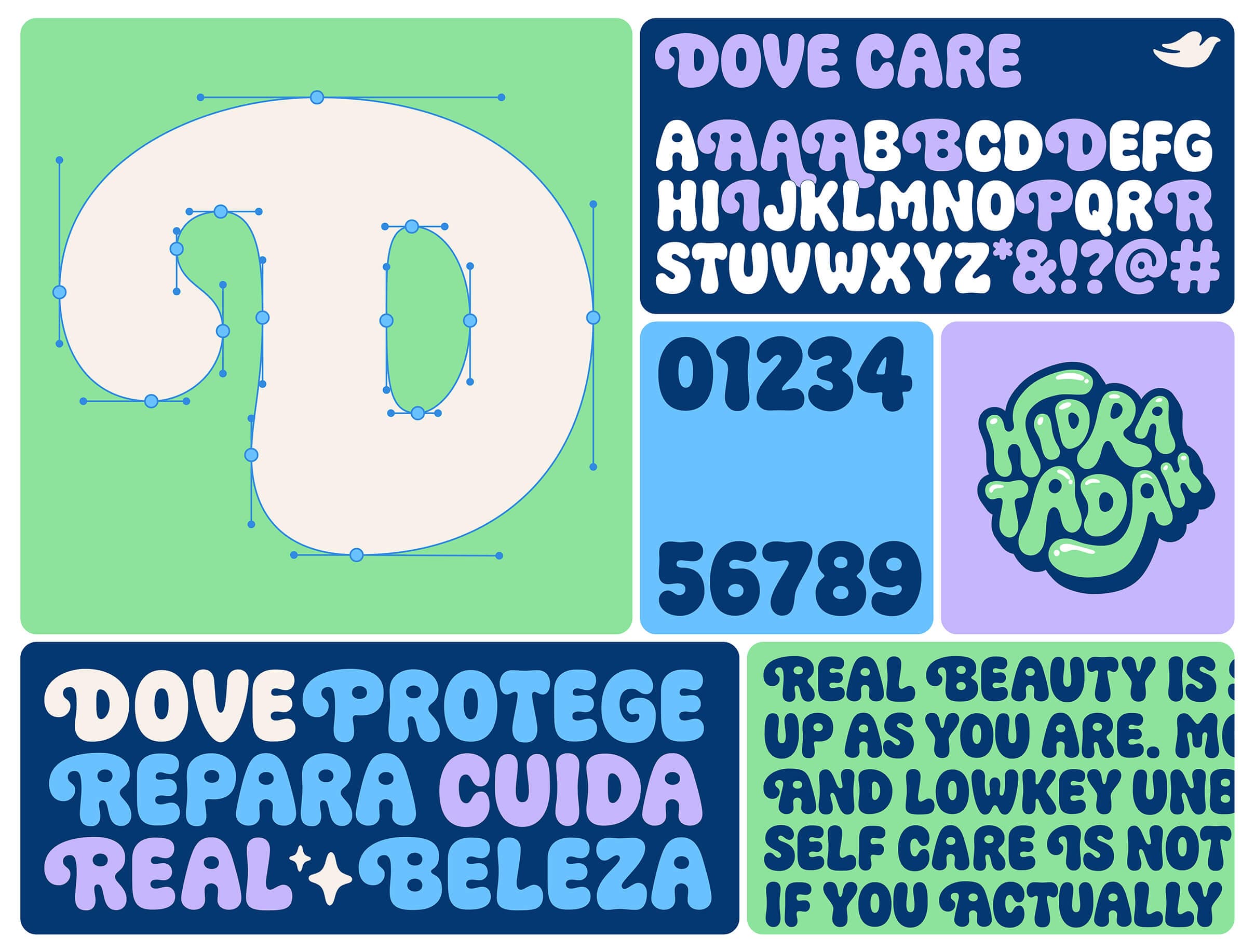
It started with 25 letterings and stickers, each one carrying a piece of what Dove stands for: care, hydration and feeling good in your own skin. From there, that handwriting turned into two typefaces that work like sisters. Dove Soft is a bouncy script with 173 characters and plenty of alternates. Dove Care is its all-caps sibling, with 73 characters and a bit more attitude. Same family, different personalities, kind of like the people in the campaign.
Credits
Art Direction & Type Design:
Lebassis
Type Production:
Júlia Lago
Assistant:
Dnego Justino
DOVE TEAM
Creative Director:
Ricardo Mill
Art Director:
Thiago Mussa
Copy Review:
Mariana Carvalho
PHOTOSHOOT
Creative Director & Photographer:
Maju Trindade
Production Company:
A Veneta
Art Director:
Bruna Pires
Stylist:
Jéssica Neves
Models:
Jess Lopes
Ana Luiza Buono
More
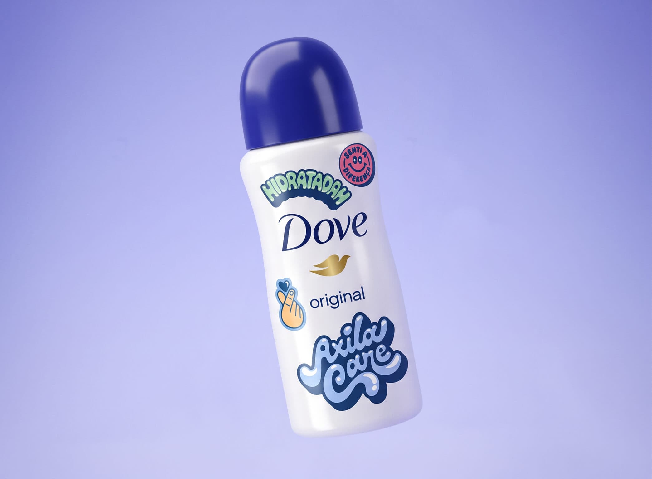
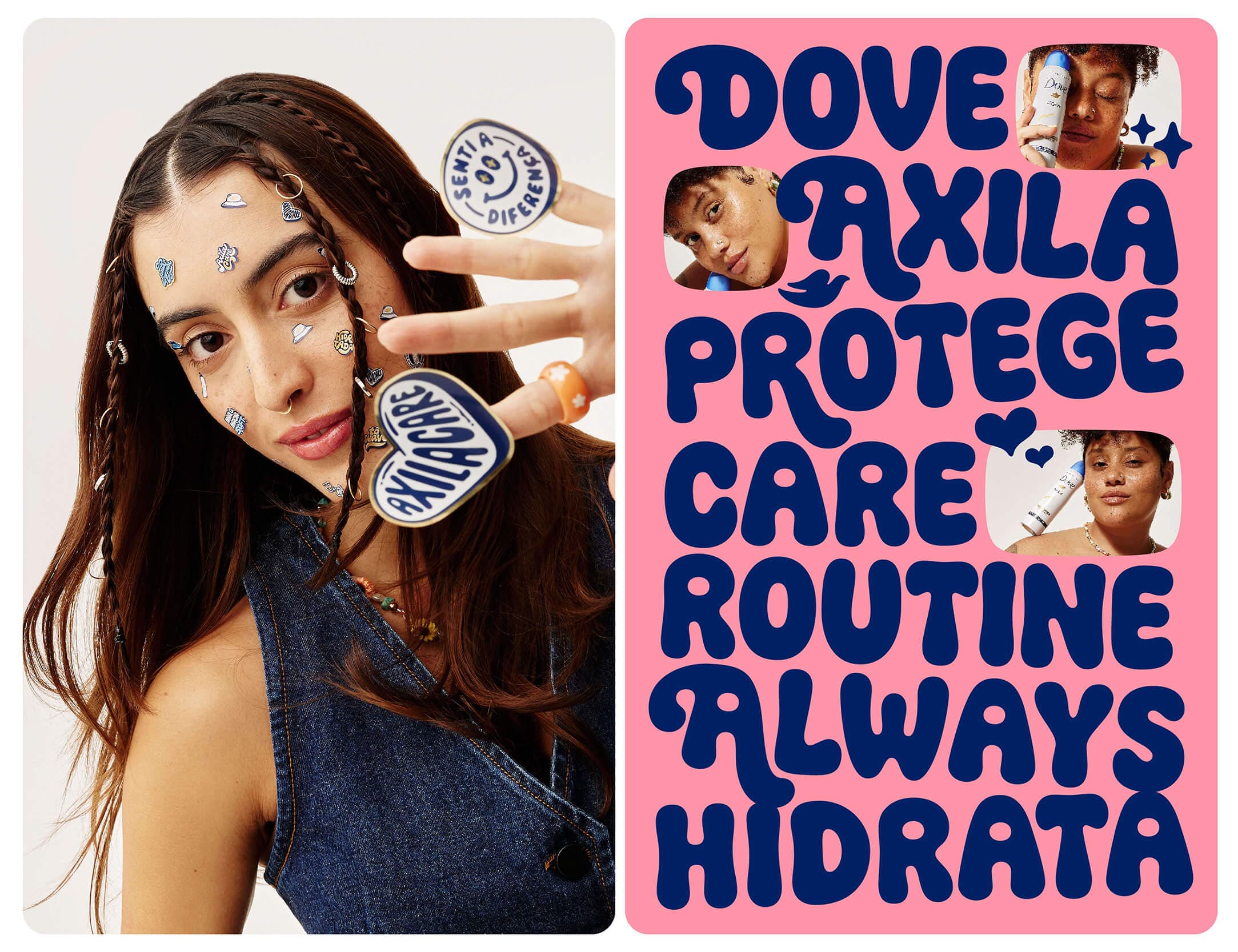
The fonts ended up everywhere, from posters and social to stickers on faces, pins and the bottle itself. They also picked up a few awards along the way: Gold in Typography at the Prêmio Brasileiro de Design 2024, Bronze at Prêmio Bornancini 2024, Platinum at CLAP 2024 and a selection at the ADG Design Biennial 2024.